Validation
HTML forms enable the collection and submission of user input on web pages. Form elements also support validation of those inputs through attributes like "required" and input types such as "email" or "number" to provide users with feedback.
Marigold's components seamlessly integrate with HTML forms, providing a developer-friendly solution for effective input data validation. It supports native attributes such as "required" and validation based on input types. Furthermore, Marigold's form elements enable the incorporation of custom validation functions, enhancing the browser's validation capabilities.
Field Anatomy
An accessible form input includes a clear label associated with its corresponding form control (<input>, <select>, ...). Additional guidance is provided by a help text, which can give additional context or instructions or display a descriptive messages.
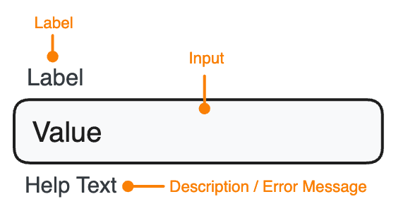
Marigold's form components allow to set these properties like shown below. All form components allow to set a label, description and errorMessages besides some additional control-specific props.
<TextField
  label="Promo Code"
  description="You can find the code on the back of your ticket."
  errorMessage="The promo code was already used."
/>
Forms and submitting Data
In HTML, forms are build using the <form> element, which wraps a set of input fields to gather and submit user data. By default, HTML forms trigger a full-page refresh upon submission. To gain control over the process, you can use preventDefault during the onSubmit event, enabling you to make a custom API call to submit the data according to your preferences.
The simplest way to get data from a form is using the browser's FormData API during the onSubmit event. This can be passed directly to fetch, or converted into a regular JavaScript object using Object.fromEntries.
Make sure to include the name attribute in each field, as it uniquely identifies each form element, facilitating server-side processing and ensuring a key-value pair for data submission.
Below is a basic example of extracting data from an uncontrolled form. Submitting a promo code won't trigger a regular form submission; instead, it will display the provided data.
Built-in Form Validation
The most straightforward way to validate user input is to use the built-in constraint validation. Marigold's form components work seamlessly with this API, allowing you to set constraints for each field. The browser will echeck these constraints on blur (user leaves the field) or when the form is submitted.
Marigold's form components utilize the same API as native HTML forms. Yet, the browser won't display error messages; instead, they will be styled to seamlessly blend with the overall design.
Here is an email subscription form. If you submit it without entering an email address or if the entered email address is invalid, an error will be displayed:
Custom Message
While browser-provided error messages are helpful, they might not be very descriptive. In such instances, you have the flexibility to override them by using a function with the errorMessages prop of the field. This allows you to display custom error messages tailored to better describe the occured error.
The example below customizes the default error messages for an unfilled required field. It's important to note that you only need to override the messages you want to; any unmodified aspects will fallback to the browser-provided messages.
Custom Validation
When the native validation options are insufficient or not ideal, it's also possible to entirely override them and implement a custom validation method by using the validate prop of a field. Ensure that the prop is assigned a function that returns one or more error messages. If there are multiple error messages, they should be provided as a string array.
The below example demonstrates a more sophisticated method for validating email addresses. The validation will always display the custom error messages. There is no separate message if the field is left empty.
Real-time Validation
By default, validation errors are shown to the user after the value is confirmed, for example, when they click away (on blur) or upon submitting the form. This prevents the user from being confused by irrelevant errors while they are still in the process of entering a value.
In specific situations though, choosing real-time validation proves beneficial, for example when enforcing certain password requirements. To enable real-time validation, control the field and configure the error and errorMessages props accordingly.
Here's an example where real-time validation is employed to check password requirements, immediately informing the user when a criteria is met.